Python ROC曲线
大约 3 分钟教学文档Python
Python 数据分析-ROC曲线
1.什么是ROC曲线
ROC的全称是“受试者工作特征”(Receiver Operating Characteristic)曲线, 首先是由二战中的电子工程师和雷达工程师发明的,用来侦测战场上的敌军载具(飞机、船舰),也就是信号检测理论。之后很快就被引入了心理学来进行信号的知觉检测。此后被引入机器学习领域,用来评判分类、检测结果的好坏。因此,ROC曲线是非常重要和常见的统计分析方法。
根据学习器的预测结果对样例进行排序,按此顺序逐个把样本作为正例进行预测,每次计算出两个重要量的值(TPR、FPR),分别以它们为横、纵坐标作图。
2.混淆矩阵
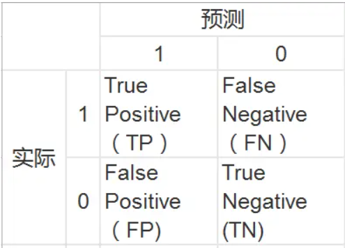
- 真正率:
- 假正率:
3.ROC曲线绘制
根据每个测试样本属于正样本的概率值从大到小排序。
下图是一个示例,图中共有20个测试样本,“Class”一栏表示每个测试样本真正的标签(p表示正样本,n表示负样本),“Score”表示每个测试样本属于正样本的概率
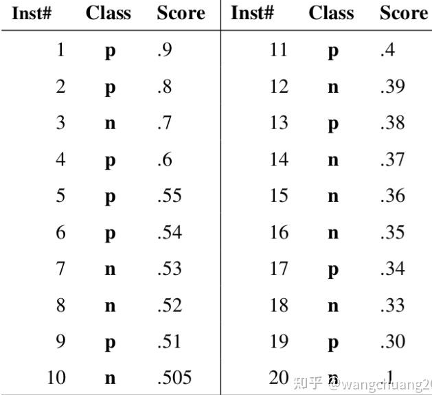
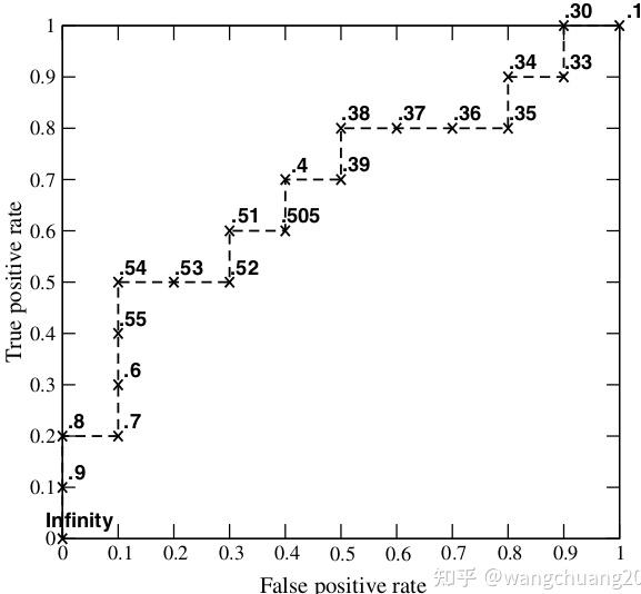
举例来说,对于图中的第4个样本,其“Score”值为0.6,那么样本1,2,3,4都被认为是正样本,因为它们的“Score”值都大于等于0.6,而其他样本则都认为是负样本。 每次选取一个不同的threshold,我们就可以得到一组FPR和TPR,即ROC曲线上的一点。这样一来,我们一共得到了20组FPR和TPR的值,将它们画在ROC曲线的结果如下图:
4.利用sklearn绘制ROC曲线
# 引入必要的库
import numpy as np
import matplotlib.pyplot as plt
from itertools import cycle
from sklearn import svm, datasets
from sklearn.metrics import roc_curve, auc
from sklearn.model_selection import train_test_split
from sklearn.preprocessing import label_binarize
from sklearn.multiclass import OneVsRestClassifier
from scipy import interp

# 加载数据
iris = datasets.load_iris()
X = iris.data
y = iris.target

# 将标签二值化
y = label_binarize(y, classes=[0, 1, 2]) # 三个类别

# 设置种类
n_classes = y.shape[1]

# 训练模型并预测
random_state = np.random.RandomState(0)
n_samples, n_features = X.shape

# shuffle and split training and test sets
X_train, X_test, y_train, y_test = train_test_split(X, y, test_size=.5,random_state=0)

# Learn to predict each class against the other
classifier = OneVsRestClassifier(svm.SVC(kernel='linear', probability=True,
                                 random_state=random_state))
y_score = classifier.fit(X_train, y_train).predict_proba(X_test) # 获得预测概率

# 计算每一类的ROC
fpr = dict()
tpr = dict()
roc_auc = dict()
for i in range(n_classes):
    fpr[i], tpr[i], _ = roc_curve(y_test[:, i], y_score[:, i])
    roc_auc[i] = auc(fpr[i], tpr[i])

# Compute micro-average ROC curve and ROC area(方法二)
fpr["micro"], tpr["micro"], _ = roc_curve(y_test.ravel(), y_score.ravel())
roc_auc["micro"] = auc(fpr["micro"], tpr["micro"])

# Compute macro-average ROC curve and ROC area(方法一)
# First aggregate all false positive rates
all_fpr = np.unique(np.concatenate([fpr[i] for i in range(n_classes)]))

# Then interpolate all ROC curves at this points
mean_tpr = np.zeros_like(all_fpr)
for i in range(n_classes):
    mean_tpr += interp(all_fpr, fpr[i], tpr[i])

# Finally average it and compute AUC
mean_tpr /= n_classes
fpr["macro"] = all_fpr
tpr["macro"] = mean_tpr
roc_auc["macro"] = auc(fpr["macro"], tpr["macro"])

# Plot all ROC curves
lw=2
plt.figure()
plt.plot(fpr["micro"], tpr["micro"],
         label='micro-average ROC curve (area = {0:0.2f})'
               ''.format(roc_auc["micro"]),
         color='deeppink', linestyle=':', linewidth=4)

plt.plot(fpr["macro"], tpr["macro"],
         label='macro-average ROC curve (area = {0:0.2f})'
               ''.format(roc_auc["macro"]),
         color='navy', linestyle=':', linewidth=4)

colors = cycle(['aqua', 'darkorange', 'cornflowerblue'])
for i, color in zip(range(n_classes), colors):
    plt.plot(fpr[i], tpr[i], color=color, lw=lw,
             label='ROC curve of class {0} (area = {1:0.2f})'
             ''.format(i, roc_auc[i]))

plt.plot([0, 1], [0, 1], 'k--', lw=lw)
plt.xlim([-0.02, 1.0])
plt.ylim([0.0, 1.02])
plt.xlabel('False Positive Rate')
plt.ylabel('True Positive Rate')
plt.title('Some extension of Receiver operating characteristic to multi-class')
plt.legend(loc="lower right")
plt.show()
参考
https://zhuanlan.zhihu.com/p/671929916